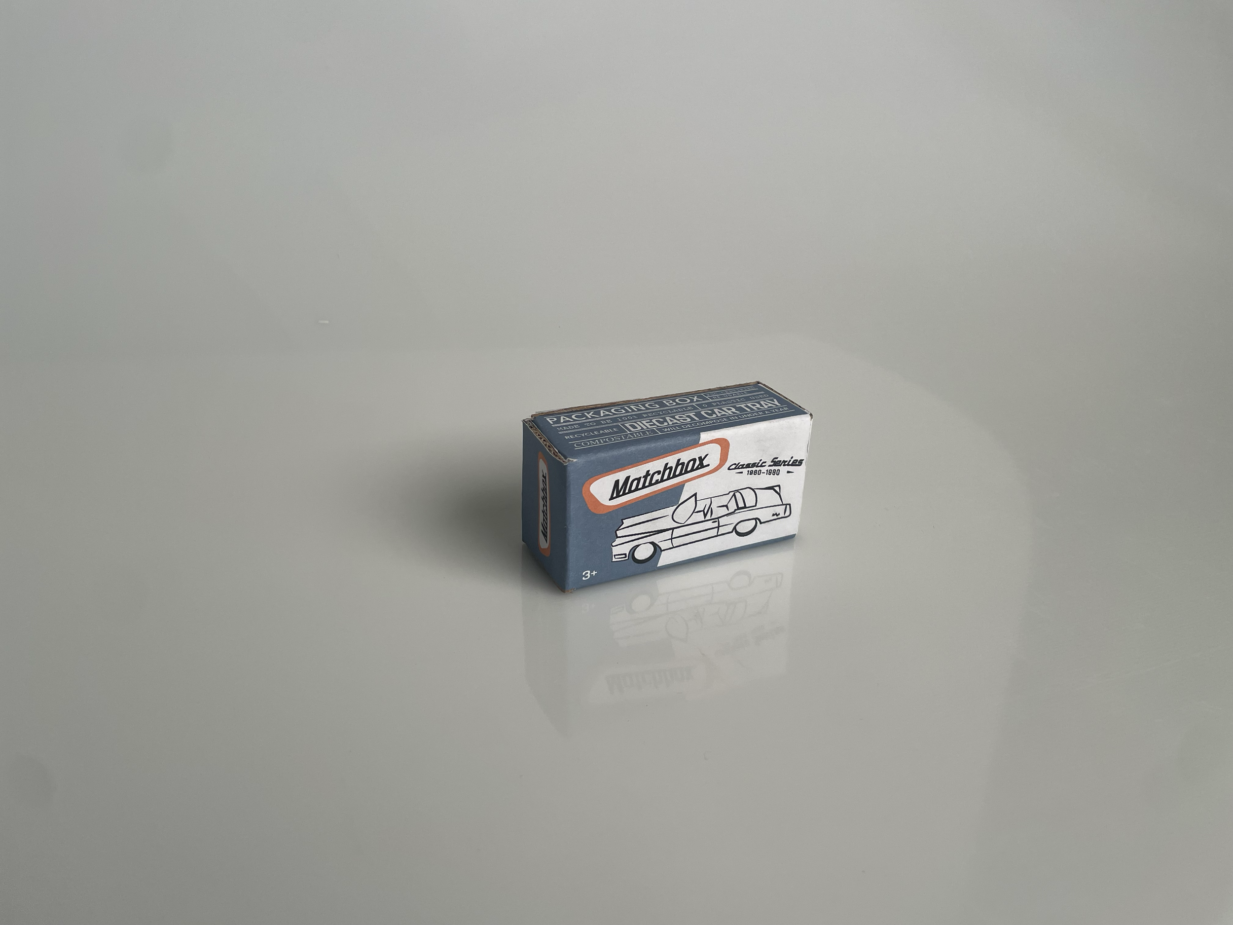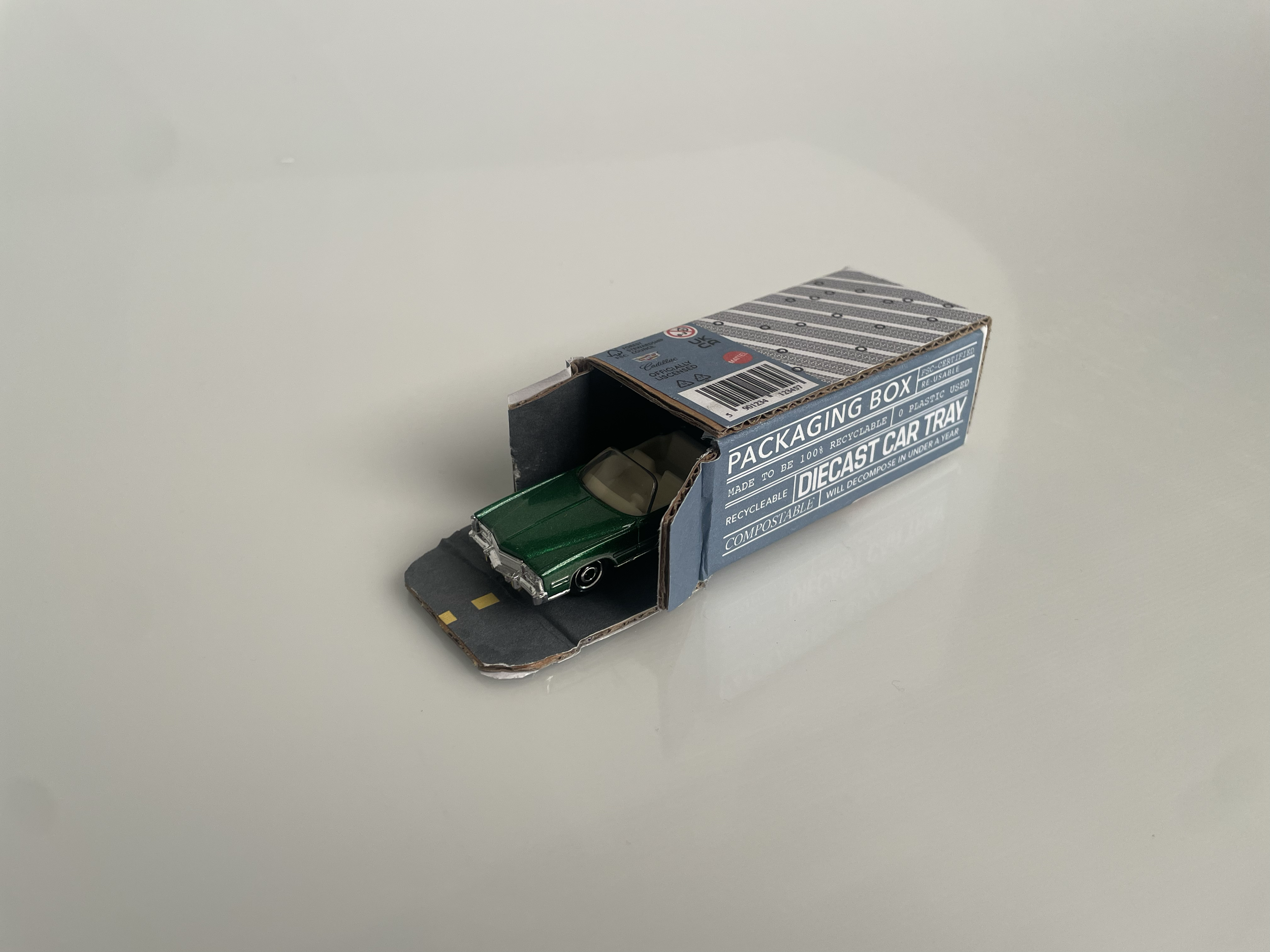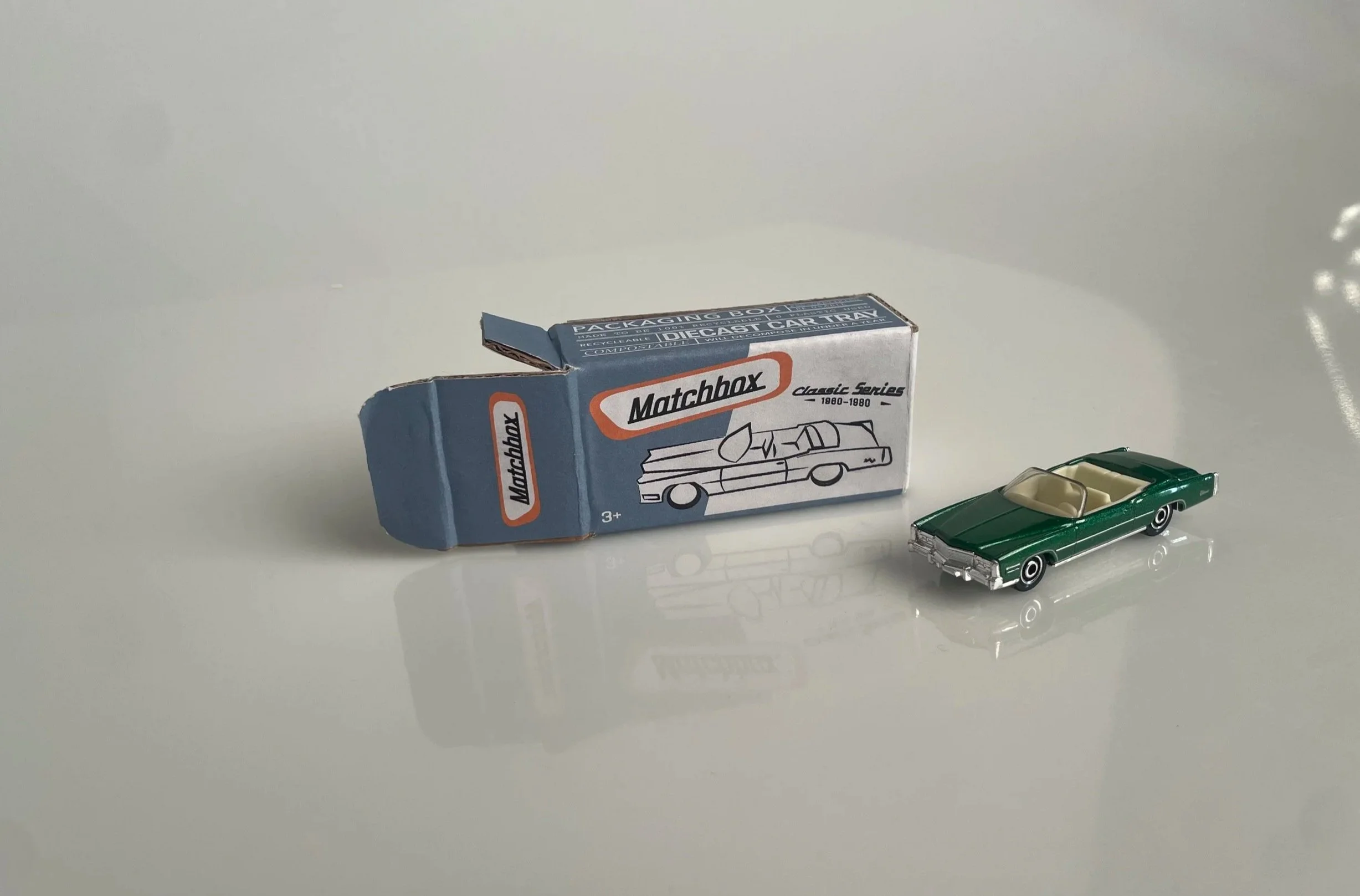
Matchbox Re-design
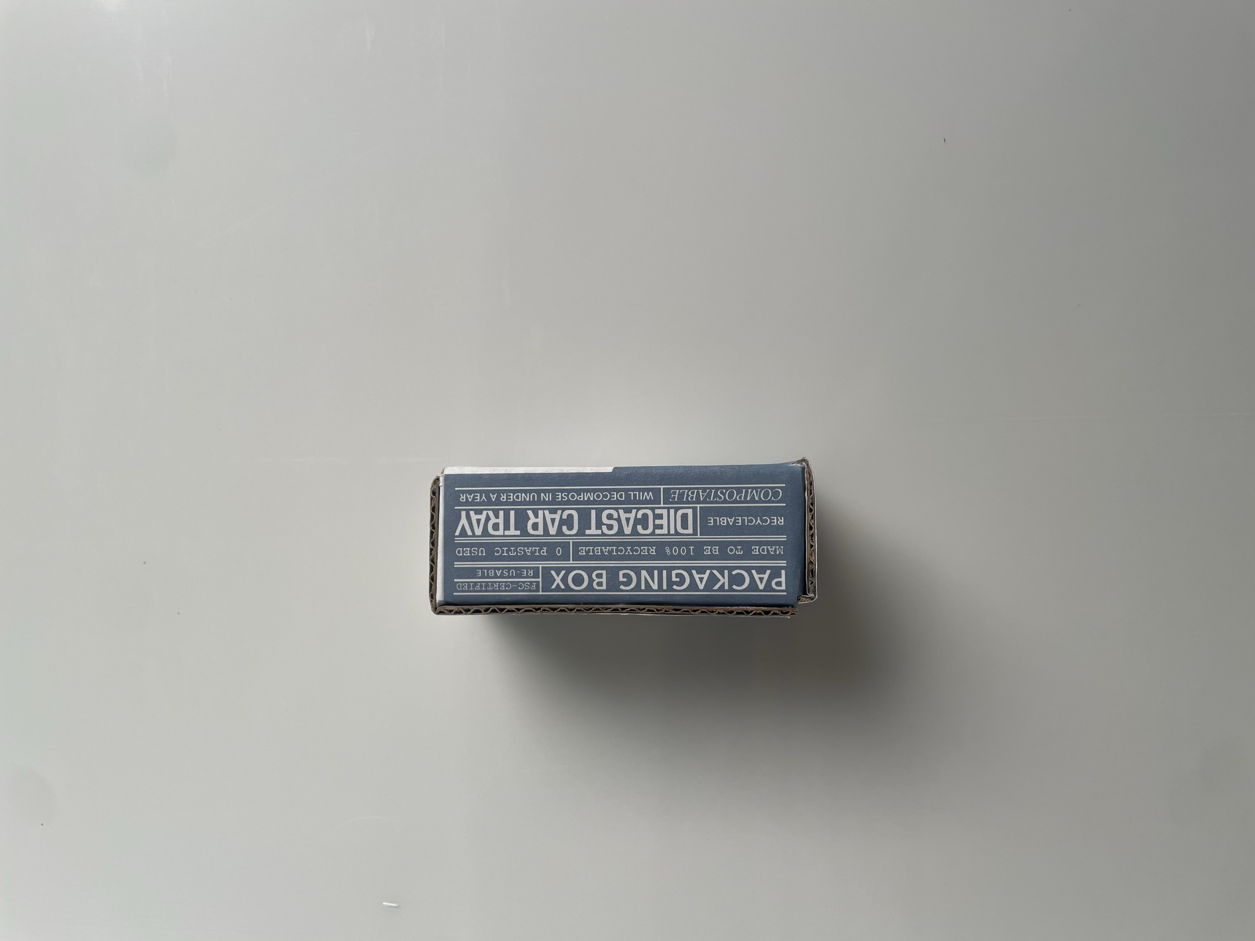
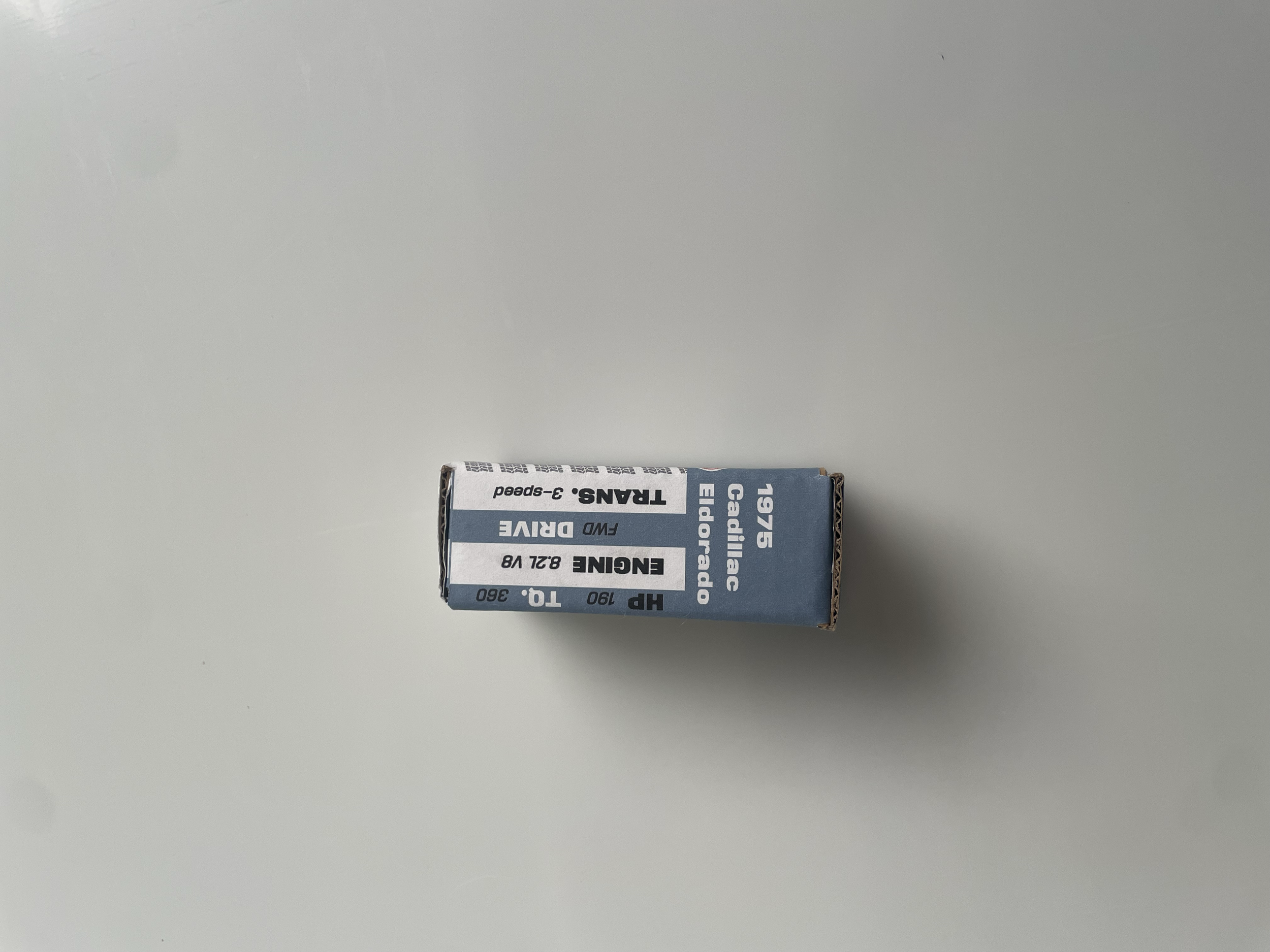
This project focuses on interaction design in its usability through play features, AR scanning using Artivive, and practical packaging. Most people throw diecast car boxes away, but making it unique to a series and functional transforms what was once trash into a collectable aspect.
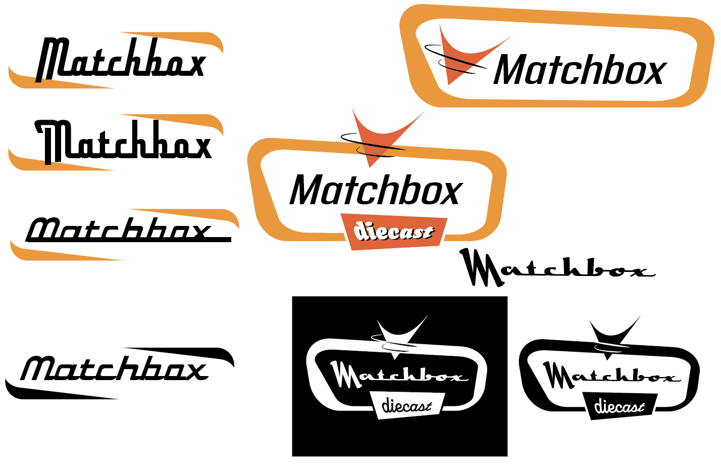
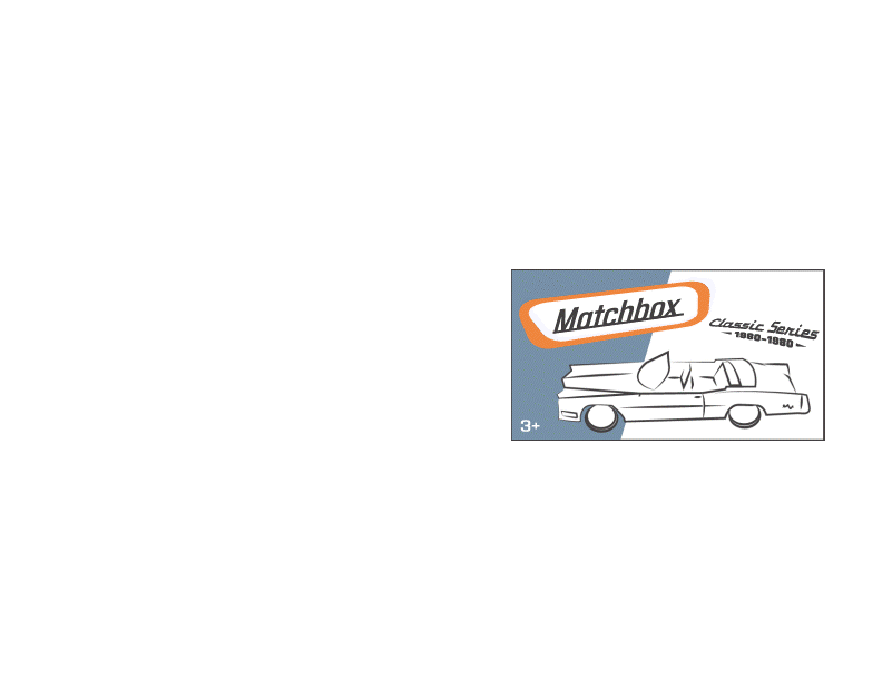
The colors from the original logo are maintained and complimented by a light blue with a vintage feeling.
The numerous typefaces are to create a sense similar to old oil can or auto part labels.
Process and Development